Thursday 27 December 2018

a t o u r i s t f o r t h e d a y


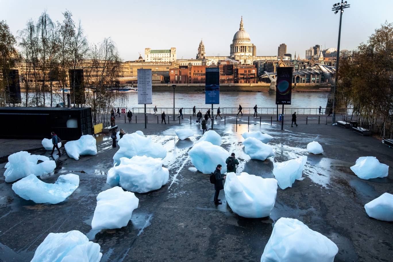
Some friends came to visit us in London for Christmas so we did some fun tourist-y art galleries with them. Starting off at Tate Modern we managed to catch what must be the final few days of Olafur Eliasson’s giant (although not so giant anymore) blocks of glacier. Overall, it’s fairly underwhelming; if the point is to confront the general public with the dangers of climate change then this is a pretty luke-warm attempt. This isn’t shocking imagery, it’s big bits of ice. Much more enjoyable are the photos of them dragging them out of the sea and all the disclaimers about how it’s not actually that bad for the planet to fly 80 tonnes of frozen water half way around the world… 


Eliasson also has a new work in the tanks, this one much subtler. Titled ‘Your Double-Lighthouse Projection’ it involves two circular rooms, one is filled with coloured light and the other with white light. The coloured room is quite nice (nice being the key word); the changing light washes over you and it’s all very pleasant but that’s where it all ends really. Niceness. 


Susan Philipsz was in another one of the tanks with a sound installation. The room is very dark with only a few dull spotlights. The ideas around the work are quite poetic; it centres on two figures that share the name ‘Lucia’ – the Italian patron saint of the blind, Santa Lucia and the dancer, Lucia Joyce. The name Lucia originates from the Latin word for light – ‘lux’ and in Sweden, the festival of Santa Lucia celebrates the coming of light on one of the darkest days of the year. While shrouded in darkness, you hear Philipsz’s voice singing three songs. The first is Will Oldham’s duet, I See a Darkness, which gives the installation its name. This is followed by Maurice Ravel’s piano piece, Pavane for a Dead Princess, which Lucia Joyce danced to with the group Les Six de rythme et couleur. The work finishes with the four-part Neapolitan folk song, Santa Lucia. This all feels very intentional and in turn gives the work some depth. 


Next up we went over to Tate Britian (the other Tate) and saw Monster Chetwynd’s new commission. It’s two giant, illuminated leopard slug sculptures each over 10 metres long. They are accompanied by swathes of blue and white LED slug trails across the building’s façade, so we would recommend going when it’s dark to get the full effect. It’s quite fun and is accompanied by a film of the mating ritual in the foyer. 


Once inside we saw the Jesse Darling show ‘The Ballad of Saint Jerome’. The basis for the exhibition is the story of Saint Jerome who was confronted by a ferocious lion and instead of reacting in fear, he recognised that the animal was injured and removed a thorn from its paw. Now tamed, the lion became his lifelong companion. A lovely catalyst for art-making and one which appears to have worked well. Our favourite works were the cowering cabinets with their bent legs, unable or unwilling to support their own weight now that the pages in the binders they’re carrying have been replaced by concrete blocks. All the works have this sense of being pained; some with plasters some with crutches, they’ve all got their own trauma. 


Finally, we went to Saatchi to see the Black Mirror exhibition since the new film is coming out soon. It was pretty disappointing due to an excess of boring paintings but was saved by two artworks, one by James Howard which was an entire wall of spam that you might be familiar with if you frequent any film streaming websites. They’re the ones that frame a video link bragging about their latest fix or warning of early symptoms. We weren’t sure about the whole wall aspect and thought that perhaps that would work better if they were positioned as one would find them on a web page but without that context. We’re being picky now but that’s only because we enjoyed the concept. 


The other piece was called ‘Cash Cow’ and was by Jade Townsend. The work depicts a sort-of convincing set of male legs holding a red painting with faded/semi-comprehensible statements about sex and smutty acts; a slow-burning critique of gender imbalance and contemporary worth, if one is to put in the time looking. With a title like ‘Cash Cow’, it’s hard to deny that some rather large bones are being picked. Townsend’s sculpture sets its sights on an ‘exclusive’ target – the art market, institution, and the ‘sub-world’ each of them operates within. A fun looking work with a message.

Thursday 20 December 2018

i ' m s o r r y : ' (


This week included an application to produce our own YouTube apology video. YouTube apologies are becoming their own genre of content, designed to emotionally manipulate viewers. At the beginning of this year the YouTube star, Logan Paul, posted a video unlike most of the other content published to his channel; lacking intro music, graphics and sound effects, it was just a dimly lit, talking head, webcam video. He appears red-eyed and starts with “I had a severe and continuous lapse in my judgement.” The video titled “So Sorry” is among YouTube’s most viral videos in 2018. It’s racked up more than 54 million views and four million comments. There are also hundreds of videos on YouTube reacting to the apology. And there are plenty more dismissing it, describing it as disingenuous and inauthentic and considering him as nothing more than a YouTuber who finally flew too close to the sun. Some have referred to it as the “first viral apology video,” a visual example of a modern celebrity fall from grace, played out in real time. The video was recorded after he received immense criticism for filming a dead body in the Aokigahara Forest, which is a notorious spot in Japan for people to commit suicide. The question then is was this authentic, or was this yet another performance, cloaked in PR-enforced sincerity? 


We proposed to produce an apology video using the myriad of techniques YouTubers use when delivering their own apologies. Ranging from the sigh at the beginning, deliberately not looking into the lens of the camera to express a false sense of vulnerability, filming themselves turning the camera off to reinforce the idea that the video was completely unedited and spontaneously crying midway through. The apology will be entirely generic and the incident will never be truly described, only spoken around. The film would be shown on a monitor on a stand, similar to one that might be found at a conference or in a school, suggesting that this is an education into YouTube apologies, a how to guide. Hopefully we get it but if not it’s a fairly simple, low budget thing to produce.


Thursday 13 December 2018

t h e a r t i s t s h a v e b e e n b u s y


Seen some good art this week! South Kiosk had Franek Wardyński’s solo show ‘Reunification of the Motherland’ which was dealing with something close to our hearts, stock images. The exhibition was all about the sad afterlife of a stock photo, it just ends up in some boring catalogue that no one ever looks at. The show was questioning what if there was a spiritual reunification with the images’ suggested origin, placing it back to the environment that it had the ambition to depict. The show itself is a short film and photographic series portraying a stock footage banner forest on its pilgrimage back to reality. The artworks deal with the issue of life as a journey, recognition and the struggle of self. It’s about liberating the forest montage, a bit like when you buy a goldfish in the market and let it go because you want it to be free. 


APT gallery had a short exhibition titled ‘Bodily Encounters’ with some exciting artists and it didn’t disappoint. All the works are beautifully made and there’s a consistency to them in that in all the works a body (individual or collective) is implied. There’s all these bodily traces, fleshy textures, stand-in bodily elements, architectural interventions and functional-looking objects that suggest human interaction. It’s very much show-don’t-tell which is always ideal. A favourite work was an amazing climbing frame by Emily Woolley that had all these small details such as hand prints in the poles as if the hulk had squeezed them a little too hard or suggesting that it was made of soft clay as opposed to metal. 


GOOD GRIEF, CHARLIE BROWN! Was mighty disappointing. The shows at Somerset House always feel museum-y and a little too educational and this one was no exception. The installation of the artwork is just so unimaginative too – everything has its own stand and its really boring. The art itself is high quality but the show as a whole is really poor. To top it all off, Andy Holden’s new film wasn’t working! It was pretty much the only reason we wanted to go and we didn’t even get to see it! Fun to see David Musgrave’s intricate snoopy anatomy artwork and Ryan Gander’s replica of Charlie Brown’s kite caught in the infamous SKATE sign atop Somerset House. Our advice would be not to bother, it’s the best work in the show you’ll save yourself 16 quid…


Thursday 6 December 2018

d i a m o n d i n t h e r o u g h


It’s come around to Bloomberg New Contemporaries again and since these people are our peers it’s fun to go. Unfortunately, it was all a bit of a mess… First of all was the nearly an hour-long queue to get in even though we arrived at the start of the private view. Secondly, once we did finally get inside it was a fiver for a tiny can of beer! The show itself felt like it was curated by numbers due to being oversubscribed; every inch of wall was covered all the way around the room with mediocre (at best) paintings with a few floor based works thrown in to even it out. Chris Alton’s work was our favourite and only work we liked. A massive banner saying ‘after the revolution they built an art school over the golf course’ – funny, insightful, and truly well made. 


Another event this week was Martin Creed’s solo show at Hauser and Wirth titled Toast. There are a couple of thoughtful ideas such as an excessively complex machine which only purpose is to wiggle a sock around on a plinth and an old classic of the intrusion/protrusion on the wall (a gold one for this show although we prefer the one which matches the wall colour). But these are minor features in a show which is dominated by awful paintings, truly uninteresting and unconsidered. 


Next was the Elephant x Griffin Art Prize which was surprisingly good. We say surprisingly because it’s a prize exhibition of younger artists and they can be fairly hit and miss but everything seemed very well done; the curatorial decisions were visible and the artworks were varied but consistently high quality. Realf Heygate was our favourite to win, due to him being a friend but also because we’re really fond of his work. he presented a number of his small, highly detailed paintings alongside one of his videos of the same content. He’s really managed to crack the art code of making things which are beautiful and desirable/sellable and also have a great idea at the centre.