Wednesday, 29 March 2017

i w i s h i w a s a l i t t l e b i t t a l l e r


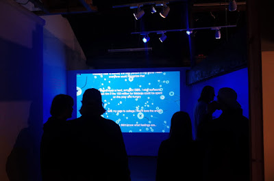
Recently we spent some time in Leeds and got to go to the opening of Mark Martin’s solo show I WISH. The main work is a script that mines wishes from social media in real-time. So there’s this continuous feed of wishes which gives a pretty funny/sometimes tragic insight into the fanciful wants, desires, longings and pains of (now) anonymous individuals. The background to the text is comprised of numerous 3d digital renditions of dandelions floating through the air. The link being that as dandelions turn to seed, children everywhere rush to pick them, so that they can close their eyes, make a wish, and blow the seeds into the air. The interesting aspect to this work is that none of the seeds have been removed from any of dandelions we see in the projection; they are untouched and fully intact. Perhaps this is a suggestion that sending these wishes into the ether of twitter isn’t going to do anything, and actually doing something would be more effective.


We’ve also come up with a new idea for the isthisit? residency since our previous idea was taken up by The Digital Artists Residency. When considering these online situations, we find it interesting to consider the idea of place and time seeing as the traditional notion of a residency is one where artists, academicians, curators, and all manner of creative people are invited to take time and space away from their usual environment and obligations. They’re supposed to provide a time of reflection, research, presentation and/or production. The situation here is slightly different in that the physical geography of the space doesn’t change because it’s all through the Internet. Now for Millicent Place’s twitter account it was a kind of month-long, duration performance work and the end result as it were is going to be the twitter feed, almost frozen in time. For isthisit? we’re thinking about how it’s an online space and how we could actually ‘travel’ to it. We’ve worked with the game Sims before, specifically the artistic pathway, and so thought this would be a perfect way of making it in line with a conventional artist residency. How it would work on the site is still not quite ironed out but we’re thinking perhaps either streaming it straight onto the website or perhaps video updates, including finished works, we’ll see how it develops.


Thursday, 23 March 2017

p l a y i n g c u r a t o r


The first group show at Dollspace is starting to come together now; we’ve picked out a number of works which we feel have some similar under currents which is interesting when thinking about the role of the curator and how actually being a good one is serious work! Especially when you’re doing open calls as opposed to hand picking artists because you have to work with what you’ve got.


Jack Fisher’s final work is now up on The SketchUp Residency website along with the press release, so check it out if you’re in that part of the internet. It’s a pretty phenomenal piece; a 21 minute play in four acts where each layer of the trolley is a new act. It spans various seasons and times and from start to finish is truly bizarre and wonderful.


Got a new work we’ve been working on for an upcoming show called Word in Transit. It was started by Campbell McConnell (check out his own work >>here<<) and it’s a spoken word event that’s going to be held on the last carriage of a tube train on the Piccadilly line. For our piece we’re employing someone to read out a text which is about verbal description. Now we all know what verbal description means but within the world of Art Beyond Sight, an organisation dedicated to making the visual arts play a vital role in the lives of people who are blind and visually impaired, ‘verbal description’ is a term to describe the use nonvisual language to convey the visual world. It can navigate a visitor through a museum, orient a listener to a work of art, or provide access to the visual aspects of a performance.


Our work is about this idea of artworks which are heard but not seen. Usually verbal descriptions might start with the standard information found on a museum's object label: artist, nationality, title, date, mediums, dimensions, and the custodian or location of the work. These are bits of information available to one set of people (the visually able) but not to another (the visually impaired). Ideas on the other hand are not something rooted in physicality, they are neither hard or soft, long or short, here or there. It is these ideas that take president within this work, taking the audience through the cognitive process around the conceptual production of it. So what we’re getting down to is that verbal descriptions are a tool to assist with building a visual world in the mind of someone who cannot access the same one the rest of us can. Now, this draws a parallel with story telling; creating a fictional world in an attempt to entertain, educate, preserve culture and instil moral values. It can also be seen as individuals refusing to accept the tyranny of reality and instead generating alternative narratives and disseminating them. The primary goal of this isn’t to mislead but to implant ideas and instil wonder. However, here, the tools which are usually employed to assist when viewing artworks are developed to create a mystery around the work on show, potentially leaving the audience unaware of what they are experiencing. The piece of writing which is being spoken is a description of the ideas within the work itself; it’s as if there was a museum label or plaque and on it is information about the label. We’re employing someone rather than doing it ourselves because the whole idea is about interpretation, there is no right and wrong in art, and it’s difficult to know what an artist was thinking about whilst producing a work. So our actor will be interpreting our words, just like a curator in a museum might interpret works of art.

Friday, 17 March 2017

t r a n s f o r m a t i o n s


Our participation in the Digital Artist Residency is well under way! Millicent Place has racked up hundreds of tweets now and has becomes very different from how we first intended it. Initially we were attempting to tell a story about an art gallery through the eyes of the person whose opinion matters least, the receptionist, almost as if she was an extra in a film. This would be giving a voice to a character whose purpose is to make a film more real but is in no way a main story line. We wanted it to create mystery around a space and people that were heard but never seen – the only evidence of their existence would be the content we uploaded to twitter. Since then the account has almost turned into an inner monologue about the art world and the people within it, with occasional tangents into ‘real world experiences’. But these opinions are constantly in opposition with themselves, going back and forth between liking and disliking, knowing and not knowing etc. It would be interesting to exhibit the work once it is complete, having the twitter feed displayed along side the schedule of events and then also the characters and their individual break downs. It would be like taking the back of a clock and seeing all the cogs and gears that go into making those hands spin round so effortlessly.


We went to see an incredibly impressive and bizarre dance piece by Arthur Pita, the man who has been described as the David Lynch of dance, so as you can probably imagine it was pretty special. Stepmother/Stepfather is experienced in two halves, the evening’s first half, Stepmother, deals with fairy tales from Snow White to Rumpelstiltskin via Red Riding Hood and potentially various other references we failed to recognise. They all go wrong  and these six creatures (potentially the ‘Stepmothers’) dressed in black leather do their best, and succeed, to literally tear the stories to pieces in a truly terrifying manner. There is a constant suggestion that this is possibly the nightmares of the central child who appear and reappears throughout.


During the second half we’re nudged a few years down the line when three cute little dolly girls, complete with giggles, discover the opposite sex and one of them ends up having relations with, assumedly, the Stepfather. The piece ends with the pair dancing in beyond the grave; her drowned in a well, him hung high from a tree, yet they create these beautiful, tear wrenching movements which feel far from a typically morbid finale. Somehow the dancers give validity and feelings to this constant stream of make believe doom and gloom. We’ve never seen movement tell such a vivid story.


Monday, 13 March 2017

m a k i n g a r t w i t h y o u r b o d y


Great to see the guys over at 12ΓΈ collective are doing 30/30 again! It's a really great way of expanding ones practice and doing some real experimentation. If you want to take part head over >>>here<<< you won’t regret it!

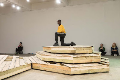
Yesterday was also the final day of the performative exhibition at Chisenhale Gallery so we went to see it. It’s by Alex Baczynski-Jenkins and he was the choreographer of the whole work. The set up is pretty minimal, its focal point an octagonal four-tiered stage whose platforms are reconfigured over the course of the exhibition. There were these red, industrial-looking, electric heaters in the walls, and folded packing blankets for both both props and seating. The lighting was also very apparent in the space, very blunt and artificial lighting and this intense soundtrack of looping rhythmic samples and continuous low drones. Every aspect of the atmosphere was manipulated to create as much tension as possible.


The movements themselves are very intimate, habitual gestures such as fingers delicately stroking a face or absentmindedly tapping a surface. Spoken word recurs in the form of poems and short exchanges, the repetition of lines and gestures building a sense of continual rehearsal. A lovely realisation for us was when the body changed from being a person to being a material; as they move on and off the stage, the performers determine how viewers negotiate the gallery space. Moments of direct address ensue when performers come right up close to the audience or hold the viewer’s gaze in tacit exchange. The way basic theatrical devices were used was another thing we noticed; they created were performing a kind of social choreography in which an experience of estrangement materialises through these bizarre interactions.

Friday, 10 March 2017

f i r s t i m p r e s s i o n s


Went to have a little peak at the Wolfgang Tillmans show at Tate Modern and were pleasantly surprised. Something we enjoyed the most was that it’s as much a large-scale installation as it is a traditional museum exhibition. The many photographs on the walls of the many rooms are curated by the artist himself, and in the artists own words, disregarding conventions of chronology and theme in favour of configurations that constitute his “personal response to the present moment”. And even though this sounds fairly wishy washy, the resulting experience is one of intensity and beauty, but which lacks a strong sense of narrative or direction. Now this can go either way, we felt it actually complimented the work it drove home this point that art is unavoidably rooted in the present, and it is this sense of immediacy that is also one of the show’s greatest strengths. This is something that is highlighted by the fact that most of the photographs on display are not glazed or even framed, but are hung on the walls from bulldog clips, heightening the sense that there is little mediation between viewer and image. It gives them a transient feeling, one that suggests that they are only there temporarily (which is true). Getting almost into a truth-to-presentation kind of place.Without a doubt the most exciting aspect of the show was when he was raising pertinent questions about the pace of technological change and developments in photographic reproduction. For example, in CLC 800, dismantled, the artist has photographed his old colour photocopier with all the screws removed; definitely an expensive piece of equipment when it was bought in 2003, by 2011 its technology was obsolete. It positions photography as both part of this technological evolution and a means for documenting it.


To us it feels unfortunate that he calls himself a photographer, because such a definition could perhaps be restraining parts of his practice. We mention this because the most notable points of the exhibition are where he asks questions about his art form, as opposed to just using it. His hints of issues such as cultural acceptance, Brexit or recorded music fall a little flat, perhaps because of a lack of context. Like we said previously, his work is best when he is pushing photography to the limits. But saying that it truly is a thought-provoking exhibition that delves into the position of photography and the artist in the current cultural climate, but doesn’t fully direct the viewer towards the wider questions it raises. Not that this is problematic and perhaps it’s intentional to give initial directions and then leave the rest to chance. Certainly a preference in our own practice.


In other news Aidan Strudwick, a fellow CSM student and artist has asked us if we would be up for collaborating with him on his degree show performance. He’s going to be producing a Santa’s grotto style work where he plays Santa (naturally) and he thought it would be fun if people could have their photographs taken in a similar fashion to our work we had at Tate Modern, Marking Time,Treading Water. We will be dressed up as elves which is less exciting but there’s the potential for free drinks so….


Monday, 6 March 2017

a l t e r n a t i v e f a c t s


The Photographers Gallery have a freshly commissioned film for the digital Media Wall by Joey Holder titled SELACHIMORPHA. It’s a screen based work, which takes a particular sequence from the 1975 film Jaws as a means to look at the ways in which manipulated images are appropriated and circulated by Internet culture as ‘fact’. The scene, which shows a shooting star flaring behind hero Roy Schneider, has become fodder for conspiracy theories. The ease of ‘adapting’ and then distributing images – such as deserts, outer space and oceans – offers a rich breeding ground for the fictional and make believe. Taking its name from a scientific classification for sharks, this project morphs between factual and fictional images, symbols and memes; exposing the continually shifting belief systems we use to define our world. A brilliant part of the film is when Donald Trump’s face morphs into Vladimir Putin and then finally into Pepe the frog, a meme which was declared a hate symbol by the Anti-Defamation League (ADL) after its increased use by anti-Semites and white supremacists last year. This work is a part of Conspiracy Week which appears to be a part of a number of politically charged shows exploring and responding to the current situation and increased confusion between fact and fiction in a ‘post-truth’ world.


We’re currently in the process of watching Westworld which is an amazing series that takes place in a technologically advanced Wild West-themed amusement park populated by androids. To attend the park visitors are required to pay £40,000 a day and may indulge in whatever they wish within the park, without fear of retaliation from the androids. It presents big, bold questions about the nature of existence and reality while carrying a gripping storyline. At one point one of the androids asks one of the humans how they know if they are real and they reply with ‘I just know, I was born and you were made’ and the silence that follows is full to burst with tension and doubt from both sides of the dialogue. Watch it. Watch it now.


Friday, 3 March 2017

p l a n n e d s p o n t a n e i t y


Onto the third day of the Digital Artist Residency and Millicent Place is going strong! It’s interesting to finally be doing the project since it’s been nearly a year since we the inception of the idea. Not that this is an issue – just good to be getting it off the ground. We’ve got a full list of staff member complete with personality traits – check out the progress >>>here<<<. Some other exhibition news is that we’re going to be showing Anything I can do is not Art because I’m not an Artist at LemoArt Gallery in Berlin as a part of a film competition.


Cannot recommend moonlight enough (big up for winning all them fancy awards). Not only is it a ground-breaking piece of cinema but it feels like it reverberates with deep compassion and universal truths; personal and poetic meditation on identity, family, friendship, and love. Truly makes you consider the moments, people, and unknowable forces that shape our lives and make us who we are. An essay could be written about the use of water alone.


Wednesday, 1 March 2017

R I P I N P E A C E


We begin this post with a slight sadness due to the closure of a gallery we’ve had both personal and professional links with in the past – Limoncello #momentofsilence. A shame to see a gallery that’s been going 10 years have to close its doors indefinitely, they had some really great artists and the private views were saturated with free drink (big up). A truly disheartening discovery on multiple levels.


Kate Owen’s show was on our list of openings to attend this week but obviously there had to be a change of plans. Carlos Ishikawa opened Tom Worsfold’s solo show titled Apparition which was a series of frenzied, maximal paintings that often featured everyday scenes like haircuts and showers. We didn’t really have any way into this work – it felt very one dimensional with very little context or meaning. It’s the sort of work that when describing the inspiration, the artist might say ‘the work comes from observing everyday life scenes and objects’, which is completely applicable and valid as an explanation but would most likely be the extent of it. Perhaps this is too harsh of a judgement to make without enough knowledge but on visiting his website to potentially find such knowledge we learnt that there was no artist statement or anything else that might point us in the right direction (not that uncommon or to be looked at negatively but it didn’t assist in our search). Something we did find was another painting that wasn’t shown titled Hangover depicting an incredibly muscly pizza guy emerging into this dark room like a God, which I can’t say supported the quest for meaning in his work. They also managed to run out or beer?! (not a reflection on the art but merely an observation – these things happen).


Auto-Italia South-East also had an opening that we attended. Slight improvement on the alcohol front being that that they actually had some. However, it was a quid for a bottle pitching right in the middle of pub price and buying from a shop price. They also had some art there which was a significant improvement (not that it’s a competition). Feral Kin is a new group exhibition project which has a few under underpinning themes including symbiotic ecosystems, esoteric tools and the importance of group work. 

We also managed to see Gavin Turk at Damien Hirst’s Newport Street Gallery. The show is very aptly named Who What When Where How and Why and is a brilliant presentation of Turk’s work which spans from him at art school all the way up to this year. The show features his infamous degree show work which has become part of the Gavin Turk legend: the provocative exhibiting of an empty studio containing just a blue ceramic ‘heritage’ plaque on the wall bearing Turk’s name and dates of occupancy. The story that the RCA refused to give him his MA definitely gave him a leg up in into art stardom. In Newport Street Gallery the little blue plaque again occupies an even more extensive space and you are still intrigued by the notions of authenticity and historical significance that he’s bringing into question. 


On approaching the end of the show we encounter some of our favourite works; the Trash Culture series in which he meticulously remakes items of rubbish – bin bags, chip forks, takeaway cartons, polystyrene cups – in cast, painted bronze. These bits of detritus, which are rendered using the finest of traditional skills, litter the gallery floors and query the art and life boundaries which seem almost non-existent here. Of course they are also laden with multiple cultural references. A painted bronze pavement, pocked with trompe l’oeil blobs of chewing gum is arranged in the format of a classic Carl Andre minimal floor-piece (though you can’t walk on this one which is a shame since it always felt like the perfect final touch to these practical materials). The giant, shining, black painted-steel replica building skip, that fills the final room, also pays homage to the Minimalist’s no-nonsense utilitarian aesthetic, as well as tipping its hat to Marcel Duchamp, whose urinal was also a container for waste. A big thumbscribe from us – keep doing you Gavin.


Corvi Mora is just around the corner so went in to check out Tomoaki Suzuki’s new show. He’s created these life-like figures which combine traditional Japanese woodcarving techniques with contemporary portraiture. Created in limewood at roughly one third of human scale, these sculptures depict the artist’s friends and acquaintances, as well as passers-by he encounters on the street near his studio in Dalston. In the press release he characterises his process as “obsessive”, saying that each sculpture begins with a series of fifteen to twenty sittings, totalling thirty hours spent with his subject in the studio. During this time, their conversation is as important to the artist as the photographs he takes from every angle, which he then spends months translating into drawings of each figure. From these drawings, he carves his portraits in limewood before painting them by hand in acrylic. We weren’t totally convinced by how the conversation would have influenced the final products but perhaps it’s more to do with what the objects represent on an emotional level. Fascinated by fashion and its signifiers of Western consumerism and multiculturalism, We saw one of these at Frieze and there too it was displayed on the floor without a plinth or protective barriers which feels like a very appropriate method of presentation; allowing them to inhabit the viewer’s physical space and elicit our identification and empathy.